
The Coca-Cola Company
Role: Creative Lead | Agency: Forpeople | Year: 2018
The Client
The Coca-Cola Company is moving away from their 'Spencerian' script logo and their direct association with their ubiquitous soda product to present itself as a company that offers dozens of different 'Beverages for Life'.
The new logotype was developed by their in-house design team in Atlanta, USA, and my role was to refine its proportions and legibility for global stakeholder approval.

The Challenge
The challenge was to envision a brand architecture around the 'Beverages for Life' concept that could structure all of the company’s products into categories, whilst proposing their look and feel for internal and possible external communications.
Using the omnipresent Coca-Cola circle, I created a series of alternative ones inspired by each of the product categories. This way, the company could be subtly linked to their star product and gain from its brand equity.
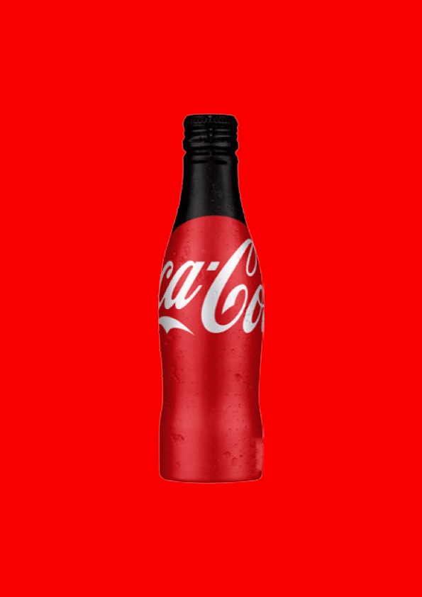
Concurrently, I capitalise from the famous Coca-Cola bottle silhouette and apply the same approach to the other products, which are also quite iconic in their packaging.
With a sturdy communications system already in place for years with their soda product, the company would benefit by using the same recognisable language with the rest of their offering, as all products could live seamlessly together once the new brand strategy rolls out.


